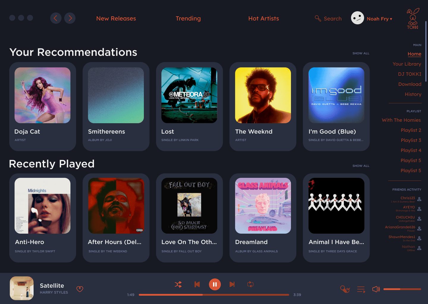
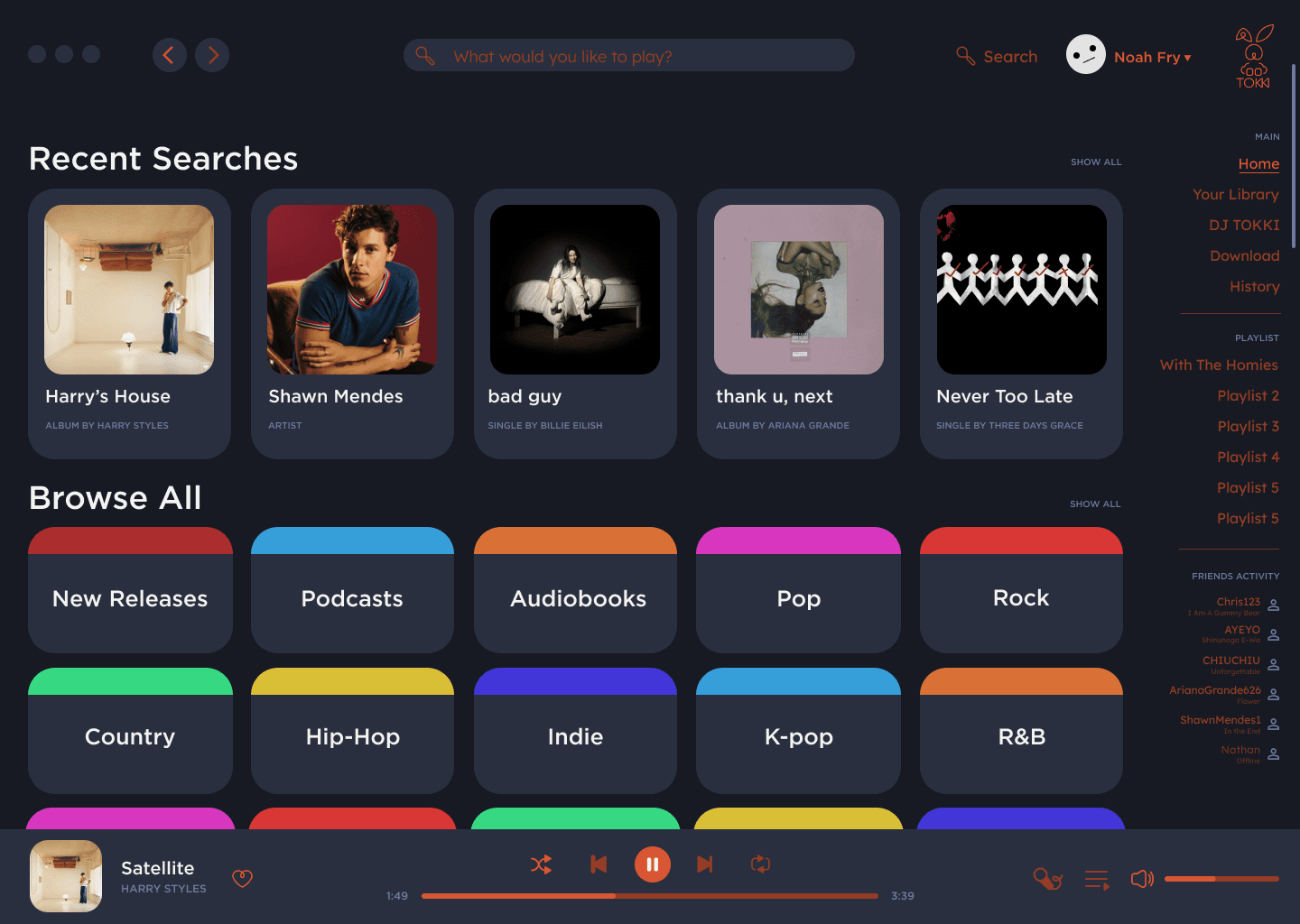
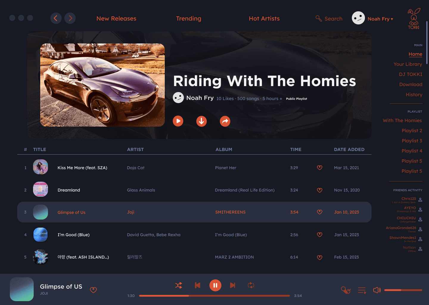
The color palette draws inspiration from the iconic colors of Christmas, incorporating vibrant shades of red and green to evoke the festive spirit. Alongside these classic hues, the palette includes a dynamic range of hues inspired by the twinkling lights of Christmas tree ornaments, creating a vibrant and playful "hue" effect.
This combination brings a sense of warmth, joy, and celebration, perfectly encapsulating the holiday season while maintaining a cohesive and lively brand identity.
TOKKI is a conceptual music streaming platform inspired by community, curiosity, and playful energy. The name "Tokki" (토끼) means rabbit in Korean — a creature known for its oversized ears, which here serve as a metaphor for deep listening and musical exploration.
The design blends clean, intuitive layout with vibrant contrast: a dark background sets the stage for punchy coral accents and glowing gradients, creating an immersive night-mode experience tailored for long listening sessions. Rounded edges and smooth hover states add a soft, friendly touch to the interface.
From playlist previews to real-time friend activity, every element is designed to celebrate music discovery in a warm and connected space.


